Brand Color Palettes: How Distinctive Colors Determine Brand Success
The selection of a brand color palette is more than an aesthetic decision; it's a foundational element of brand design and creation that sets the stage for consumer recognition and preference. Here, we'll uncover the critical role distinctive colors play in branding, highlighting how strategic choices can significantly impact a brand's success.
The Psychological Impact of Colors in Branding
As we’ve previously covered, color is more than a simple visual tool, colors transcend visual appeal by wielding significant psychological influence. Research from the University of Winnipeg, reveals that up to 90% of initial product evaluations are swayed by color. Such findings underscore the profound effect color choices have on branding and consumer decision-making processes.
Competitive Differentiation Through Color in Brand Design
In the world of brand creation and design, differentiation within oversaturated markets is crucial. A well-curated, distinctive color palette acts as more than just an aesthetic choice; it's a strategic beacon that distinctively positions a brand within its competitive landscape. This pursuit extends beyond selection of unique colors—it's about crafting a decision that resonates deeply with your brand's identity and resonates with your target audience of marketers and designers.
Colors possess the unique ability to evoke specific emotions and qualities, playing a crucial role in brand design. For instance, red can encapsulate excitement and energy, aligning perfectly with brands that embody dynamism and boldness. Conversely, brands aspiring to communicate credibility and safety might gravitate towards the calming hues of blues or greens.
Understanding the emotional and psychological impact of colors, coupled with their industry relevance, is paramount. Brands that strategically select and implement a unique color scheme not only capture the attention but create lasting impressions on consumers. These choices help portray the brand’s narrative and should align with its overarching story and values.
Consider the innovation of certain tech brands that break the mold with vibrant and unconventional color palettes, setting themselves apart in a sector traditionally dominated by blacks, grays, and whites. Similarly, newcomers in the food and beverage sector might employ striking color combinations to command attention amidst crowded retail shelves.
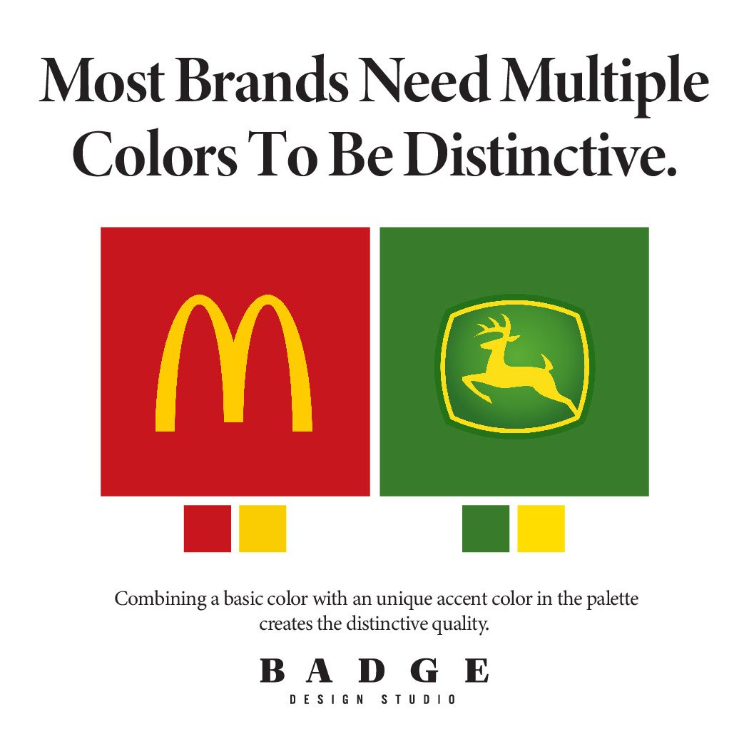
The mastery of brand design lies in the balance—a color palette that is both distinctive and in line with the brand's image and sector norms. Same but different. Through strategic color use, a brand can distinguish itself, embedding a key element of its identity in the consumer's mind, ensuring it stands out in a competitive set.
Balancing Innovation & Tradition: Embracing Category Norms in Brand Color Selection
Navigating the delicate balance between innovation and tradition is crucial in brand color selection. While the essence of standing out remains key, acknowledging and aligning with the established color norms of your product category presents a unique advantage. This alignment is not only a nod to tradition but a strategic move that leverages color familiarity to foster instant product category recognition among consumers. Colors such as green, emblematic of health and wellness, or the luxurious connotation of black and gold, have become deeply ingrained in consumer consciousness, acting as signifiers for specific industries.
Opting for a color palette that echoes these industry standards can significantly benefit brands, enhancing consumer quick identification and imbuing a sense of trustworthiness. Such strategic alignment, however, does not mean forgetting about uniqueness. The art lies in the deliberate integration of traditional hues with distinctive combinations or accents, crafting a brand identity that both respects consumer expectations and boldly asserts its unique position.
This approach to brand color selection underscores the importance of understanding and respecting category norms while asserting a brand’s individuality. By skillfully blending established colors with unexpected ones, brands can achieve a balance that captivates consumers, ensuring the brand remains both recognizable and distinct.
The Cornerstone of Brand Identity: The Role of Consistency in Color Strategy
The significance of selecting an appropriate color palette for a brand cannot be understated, yet it's the consistency in its application that truly builds brand recognition. Research conducted by the University of Loyola, Maryland, underscores this point, revealing that consistent use of color can boost brand recognition by as much as 80%. This statistic highlights the profound impact of color on the consumer's perception and the incredible mark it leaves on brand identity.
Achieving a level of recognition that resonates with consumers requires a long-term commitment to strategic precision and unwavering consistency. This journey spans every touchpoint with the consumer, from the product itself to the digital realm, encompassing websites and social media, and extending to printed marketing materials. The integration of a consistent color palette across these platforms is not solely an exercise in aesthetics; it's a strategic endeavor that fosters brand identity and cultivates a deep sense of loyalty among consumers.
The rewards of this dedication are invaluable. Beyond enhancing brand recognition, a consistent color strategy plays a pivotal role in building a strong brand identity, serving as a foundation for consumer trust and loyalty. It is through this lens that the strategic use of color transcends its visual component, becoming a cornerstone element in the narrative of a brand's journey towards establishing a lasting impression in the minds of its audience.
Cementing Brand Success Through Strategic Color Selection
The journey towards building a distinctive brand identity transcends aesthetic considerations, positioning the choice of a color palette as a cornerstone of strategic brand development. This decision encompasses a blend of psychological understanding, competitive differentiation, commitment to consistency, cultural awareness, and the agility to adapt to changing market dynamics.
This underscores the essence of brand creation and design as a critical business strategy. It highlights the importance of a meticulously chosen color palette in articulating a brand's identity, fostering consumer loyalty, and navigating the competitive landscape with distinction. As brands continue to navigate the complexities of market presence, the choice of color emerges as a pivotal element in the strategic toolkit of branding, offering a path to distinctiveness and consumer recognition.

